If you’re looking for a versatile, elegant off-white that brings warmth and sophistication into any space, Benjamin Moore Mountain Peak White might be your perfect match. In this Benjamin Moore Mountain Peak White Color Review, we’ll explore the undertones, LRV, coordinating colors, best use cases, and expert tips for styling this timeless hue.
Whether you’re repainting a cozy living room, upgrading your cabinetry, or curating a serene bedroom palette, this paint color is a designer favorite for a reason. Let’s dive into this complete review to understand why.
🎨 What Color is Benjamin Moore Mountain Peak White?
Mountain Peak White (OC-121) is a warm off-white paint color from Benjamin Moore’s Off-White Collection. With a slightly creamy base, it offers a soft, inviting tone that avoids being too yellow or stark.
It’s ideal for homeowners or designers seeking a neutral white that doesn’t feel sterile or overly cold. This makes it a versatile backdrop for both traditional and modern interiors.
🔢 Technical Specs
Here are the key specifications that define Mountain Peak White (OC-121):
- Color Code: OC-121
- LRV (Light Reflectance Value): 82.36
- RGB Values: R: 243, G: 240, B: 229
- HEX Code: #F3F0E5
- Undertones: Warm, creamy with slight beige-golden hints
🌡️ Understanding the Undertones
One of the most important parts of any color review is understanding its undertones.
Mountain Peak White has warm undertones, leaning more toward a soft beige or creamy ivory rather than a stark or icy white. This makes it an excellent choice for:
- South-facing rooms that get a lot of natural light
- Traditional spaces with wooden furniture or beige tones
- Kitchens or living rooms with warm metallic accents (brass, gold)
Note: In rooms with cooler lighting or north-facing windows, the warm undertones may show more clearly, which could contrast sharply with cooler grays or blues.
💡 Where to Use Mountain Peak White
Here’s how this color shines in different parts of your home:
✅ Interior Walls
Mountain Peak White makes a beautiful wall color, especially for:
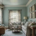
- Living Rooms: Softens the space and makes it feel calm and cozy.
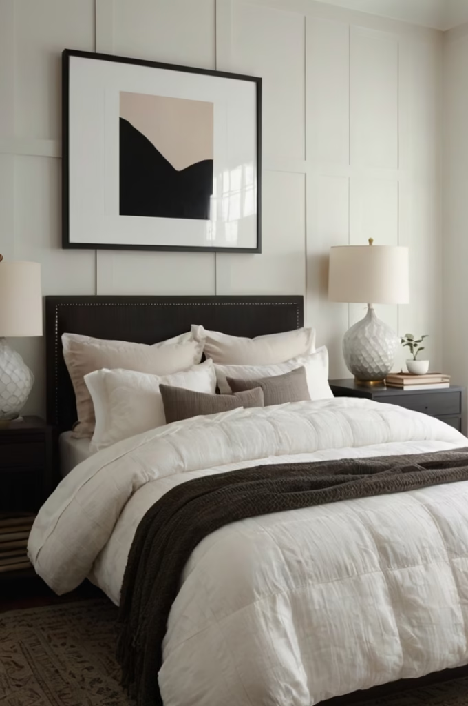
- Bedrooms: Creates a relaxing retreat without the starkness of pure white.
- Hallways: Reflects light well, making narrow spaces feel open.
✅ Trim and Cabinetry
Use it as a contrast against deeper wall colors or as a clean, warm trim in more traditional homes.
- Kitchen Cabinets: Looks great with brass hardware and wood flooring.
- Molding & Trim: Pairs nicely with earth-tone or greige walls.
✅ Ceilings
Because of its high LRV, Mountain Peak White also works for ceilings if you want to keep a warm, cohesive look throughout the space.
🎯 Benjamin Moore Mountain Peak White vs Similar Whites
Let’s compare Mountain Peak White with a few similar whites from Benjamin Moore’s collection:
| Paint Color | Undertone | LRV | Difference |
|---|---|---|---|
| White Dove (OC-17) | Warm gray/cream | 85.38 | Slightly cooler and brighter |
| Simply White (OC-117) | Slight yellow | 91.7 | Brighter, more reflective |
| Cloud White (OC-130) | Soft yellow-cream | 87.35 | More yellow than Mountain Peak White |
| Swiss Coffee (OC-45) | Beige-warm | 81.91 | Slightly darker and more beige |
While White Dove and Simply White are common alternatives, Mountain Peak White offers a more balanced warmth that suits traditional and transitional decor styles especially well.
🎨 Best Color Pairings
To create a harmonious palette with Mountain Peak White, consider these options:
Neutral Pairings:
- Revere Pewter HC-172 – A warm greige that looks cozy and elegant.
- Edgecomb Gray HC-173 – A soft taupe that complements Mountain Peak’s warmth.
Bold Accent Colors:
- Hale Navy HC-154 – Deep blue for high contrast and drama.
- Kendall Charcoal HC-166 – Rich charcoal for a timeless vibe.
Natural & Earthy Tones:
- Warm terracotta, olive green, soft sage, or beige.
- Wood accents, rattan, and natural textures work beautifully with Mountain Peak White.
🛠️ Tips for Using Mountain Peak White
Here are some practical tips before you commit:
- Test Samples First: Always sample the color on multiple walls and observe it throughout the day under different lighting conditions.
- Use in Warmer Palettes: This white thrives in color schemes that include warm tones.
- Avoid with Cool Tones: If your home leans heavily toward cooler grays or blues, Mountain Peak White may appear too yellow.
🏠 Real-Life Style Ideas
Here are a few ways designers and homeowners are using Mountain Peak White:
- Modern Farmhouse Kitchens: Pair with natural wood shelving and matte black fixtures.
- Classic Living Rooms: Combine with whitewashed oak floors and linen sofas.
- Vintage Bathrooms: Use for walls and trim alongside black-and-white floor tiles.
🔍 Final Verdict: Is Mountain Peak White Right for You?
In this Benjamin Moore Mountain Peak White Color Review, we’ve seen that this shade offers versatility, elegance, and warmth. It’s a go-to color if you’re aiming for a cozy yet clean aesthetic that won’t feel too stark or too creamy.
While it may not suit ultra-modern or cool-toned homes, it’s a fantastic choice for those looking to warm up their interiors with a refined, timeless off-white.
✅ Key Takeaways
- LRV: 82.36 – light and reflective without being sterile.
- Undertones: Warm, creamy with soft golden hints.
- Ideal Uses: Walls, cabinetry, trim, and ceilings.
- Best Paired With: Earthy neutrals, bold navies, and soft taupes.
- Not Ideal For: Homes with heavy cool tones or industrial gray palettes.
🖌️ Where to Buy Benjamin Moore Mountain Peak White
You can find Mountain Peak White OC-121 at any authorized Benjamin Moore retailer or order a sample directly from their official website.
Don’t forget to try a peel-and-stick paint sample first to ensure the color works with your lighting and furnishings!
📌 Final Thoughts
If you’re searching for a soft, warm white that blends traditional charm with modern versatility, Benjamin Moore Mountain Peak White could be the paint color you’ve been waiting for.
It’s understated yet full of character—perfect for making any room feel inviting and timeless.

Haris Virk is the creative force and expert content strategist behind ScrapSafari.com. As an accomplished writer and designer, Haris leads the development of innovative content and visually stunning images that captivate audiences. His extensive experience in crafting engaging articles and unique design ideas makes him a pivotal contributor to ScrapSafari’s success.
Haris’s keen eye for aesthetics and trend forecasting ensures that every piece he produces not only informs but also inspires readers. His proficiency extends to mastering Pinterest strategies, where his thoughtfully crafted pins drive significant traffic and amplify the site’s reach.
With a passion for creativity and a deep understanding of content dynamics, Haris Virk brings a distinctive blend of originality and strategic thinking to the ScrapSafari team, solidifying its place as a go-to source for design, ideas, and inspiration.