Muted Colors in Home Decor have surged in popularity as homeowners seek calm, cozy, and contemporary spaces that inspire creativity and relaxation. In 2025, the trend is all about embracing soft yet sophisticated hues that offer warmth and subtle depth—perfect for modern living without relying on flashy, high-tech elements.
In this article, we explore 10 of the best muted colors you can use to transform your home into a serene haven. We also include key facts, FAQs, and practical tips to help you integrate these tones into your everyday decor.
1. Misty Gray

Description:
Misty gray is a gentle, neutral tone that creates a peaceful atmosphere. It serves as an excellent backdrop for art, natural textures, and accent pieces.
How to Use It:
- Walls & Ceilings: Use it on walls to provide a subtle foundation.
- Accents: Pair with natural wood and soft fabrics for a layered look.
- Furniture: Choose upholstered pieces in misty gray for a modern, airy feel.
2. Dusty Blue

Description:
Dusty blue brings a cool, calming energy into your living space. Its serene vibe makes it ideal for bedrooms and bathrooms where tranquility is key.
How to Use It:
- Accent Walls: Create a focal wall behind your sofa or bed.
- Textiles: Integrate in curtains, throw pillows, or bedding.
- Art & Decor: Combine with natural materials like linen or woven baskets to enhance its calming effect.
3. Sage Green

Description:
Sage green is inspired by nature and conveys organic elegance. This muted hue works beautifully in any room, especially in spaces meant for relaxation.
How to Use It:
- Living Areas: Apply as a wall color to evoke a natural, outdoor feel indoors.
- Plant Pairings: Complement with real or faux greenery to deepen the connection with nature.
- Furniture: Use in accent chairs or cushions to add a subtle pop of color.
4. Blush Pink

Description:
A soft blush pink offers warmth and a touch of romance without overwhelming the senses. It’s particularly appealing in spaces where comfort and intimacy are desired.
How to Use It:
- Feature Walls: An accent wall in blush can create a gentle, welcoming focal point.
- Textiles: Incorporate through rugs, cushions, and bedding for an added layer of softness.
- Mix & Match: Pair with grays, creams, or even sage greens for a balanced look.
5. Muted Mustard

Description:
Muted mustard is a rustic yet refined hue that provides warmth and depth. It’s less intense than its vibrant counterpart, making it perfect for adding character without overpowering a room.
How to Use It:
- Accent Pieces: Use on throw pillows, vases, or artwork frames.
- Combination: Pair with earthy tones like olive or terracotta to create a cohesive, grounded palette.
- Furniture: Consider a statement piece like an armchair upholstered in muted mustard.
6. Terracotta

Description:
Terracotta channels the warmth of sun-baked clay, offering a cozy, inviting feel. This earthy tone is perfect for adding a touch of rustic charm.
How to Use It:
- Flooring & Tiles: Opt for terracotta tiles to bring an organic vibe to your entryway or kitchen.
- Accent Walls: A terracotta accent can evoke a Mediterranean warmth.
- Decorative Accents: Integrate through pottery, planters, and textiles for an authentic, artisan look.
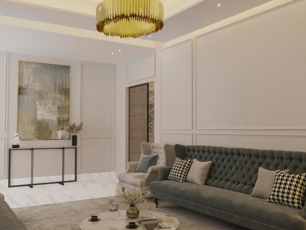
7. Olive Green

Description:
Olive green is a sophisticated and mature shade that exudes calm and balance. Its subdued quality makes it versatile across different decor styles.
How to Use It:
- Walls: Perfect for creating an accent wall in living rooms or dining areas.
- Furnishings: Use olive green in upholstery or drapery to evoke a timeless feel.
- Contrasting Elements: Pair with soft neutrals and metallic accents to create a layered, modern aesthetic.
8. Dusty Lavender

Description:
Dusty lavender is a unique twist on traditional purples—subdued, elegant, and soothing. It offers a whimsical yet mature take on color.
How to Use It:
- Bedrooms: Ideal for creating a serene retreat.
- Accents: Use in decorative accessories like cushions, throws, or small accent pieces.
- Pairings: Combine with creams and grays for a chic, refined look.
9. Taupe

Description:
Taupe, a blend of gray and brown, is the ultimate neutral that offers warmth without starkness. Its versatile nature makes it suitable for nearly any setting.
How to Use It:
- Walls & Ceilings: Serve as a backdrop for more vibrant decor elements.
- Textiles: Use in soft furnishings for a cozy, inviting ambiance.
- Modern Combinations: Pair with bolder accents like deep navy or emerald green for a modern twist.
10. Subdued Teal

Description:
Subdued teal is a perfect balance between blue and green, offering both serenity and depth. It’s ideal for creating a space that feels both contemporary and timeless.
How to Use It:
- Accent Walls: Use on one wall to create an interesting focal point.
- Decorative Items: Integrate through ceramics, vases, or artwork.
- Layering: Combine with neutrals like taupe or soft white to ensure the color remains sophisticated and balanced.
Key Facts About Muted Colors in Home Decor
- Trendy in 2025: Homeowners are increasingly gravitating toward muted colors for their ability to create calm, balanced spaces that reflect contemporary lifestyles.
- Sustainability: Many muted color palettes are inspired by natural materials and sustainable design practices, resonating with eco-conscious consumers.
- Versatility: Muted tones can easily be integrated with both modern and rustic design elements, making them a flexible choice for various decor styles.
- Cozy and Inviting: These colors provide a warm and comfortable ambiance, ideal for spaces intended for relaxation and social gatherings.
- Layering Potential: Muted colors work well in layers, allowing for creative mixing with textures and materials like wood, linen, and ceramics.
FAQs – Muted Colors in Home Decor
Q1: Why are muted colors trending in 2025 home decor?
Muted colors resonate with modern sensibilities—offering a calming, timeless look that complements natural materials and sustainable design principles.
Q2: Can I use these colors in small spaces?
Absolutely. In fact, muted tones like misty gray or taupe can make small spaces appear larger and more open due to their subtle nature.
Q3: How do I choose the right muted color for my home?
Consider the natural light in your space, your furniture and decor style, and the mood you want to create. Testing swatches on your walls before a full application is also recommended.
Q4: Are muted colors only for walls?
Not at all! These hues can be applied in textiles, furniture, and accessories, providing a cohesive design throughout your home.
Q5: How can I mix muted colors effectively?
Start with a neutral base, then introduce complementary hues through accent pieces. Layer different textures to add depth without overwhelming the subtle palette.
Conclusion
Muted Colors in Home Decor are more than just a trend—they are a lifestyle choice that embraces subtlety, warmth, and authentic design. The 10 colors listed above offer a versatile range of options for every room and every style. By integrating these hues thoughtfully, you can create spaces that are both modern and timeless, cozy yet sophisticated. Whether you’re repainting a room or refreshing your decor with new accents, these muted tones provide an inspiring and sustainable way to transform your home in 2025.
Embrace the beauty of simplicity, and let these colors tell the story of your unique style and personality. Enjoy the process of curating a space that truly feels like home!

Haris Virk is the creative force and expert content strategist behind ScrapSafari.com. As an accomplished writer and designer, Haris leads the development of innovative content and visually stunning images that captivate audiences. His extensive experience in crafting engaging articles and unique design ideas makes him a pivotal contributor to ScrapSafari’s success.
Haris’s keen eye for aesthetics and trend forecasting ensures that every piece he produces not only informs but also inspires readers. His proficiency extends to mastering Pinterest strategies, where his thoughtfully crafted pins drive significant traffic and amplify the site’s reach.
With a passion for creativity and a deep understanding of content dynamics, Haris Virk brings a distinctive blend of originality and strategic thinking to the ScrapSafari team, solidifying its place as a go-to source for design, ideas, and inspiration.