Creating a serene and tranquil environment at home begins with the right paint colors. The psychology of color plays a significant role in setting the mood of a room. Calming paint colors can reduce stress, foster relaxation, and promote overall well-being.
In this comprehensive guide, we will explore 15 of the most soothing hues to transform your living spaces into peaceful retreats, as well as tips for using these colors, popular combinations, and answers to frequently asked questions.
Why Calming Paint Colors Matter
Calming paint colors affect our emotions and can create a soothing ambiance. They are ideal for bedrooms, living rooms, and any space where relaxation is a priority. Incorporating these colors can help with:
- Reducing Stress: Gentle shades can have a calming effect on the nervous system.
- Enhancing Sleep: Soft, muted tones are perfect for creating a restful atmosphere in bedrooms.
- Boosting Productivity: In workspaces, calming hues can help reduce distractions and increase focus.
How to Choose Calming Paint Colors
When selecting calming paint colors, consider:
- Room Purpose: Bedrooms benefit from softer shades, while living areas can incorporate slightly warmer tones.
- Lighting: Natural light enhances cool tones, while artificial light can add warmth to neutral shades.
- Personal Preference: Choose colors that evoke positive emotions and align with your taste.
15 Calming Paint Colors for Your Home
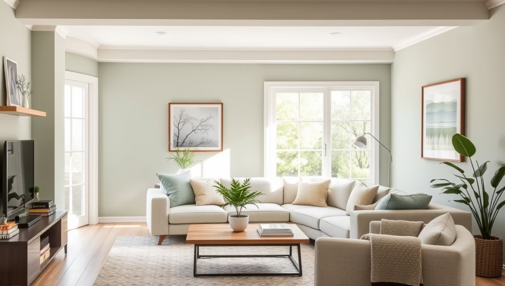
1. Soft Sage Green
Sage green is a versatile color that evokes feelings of renewal and connection to nature. Ideal for living rooms or bathrooms, this muted green pairs beautifully with natural wood accents and crisp white trim.

2. Pale Blue
Often associated with the sky and sea, pale blue is a classic calming color. It works well in bedrooms or nurseries, promoting tranquility and restfulness. Pair it with soft beige or white for a breezy look.

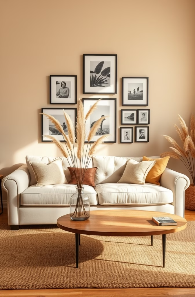
3. Warm Beige
Beige offers a cozy and neutral backdrop that creates a sense of stability. This color works well in living rooms and dining areas, especially when paired with warm wood tones and textured fabrics.
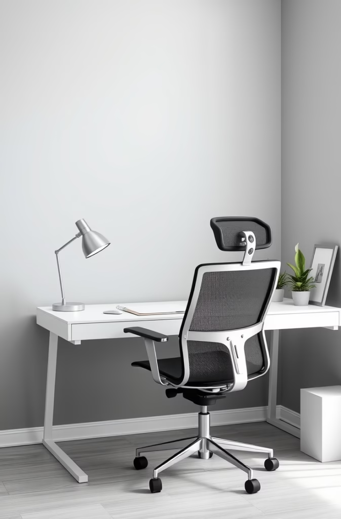
4. Misty Gray
Light gray with cool undertones provides a sophisticated and serene atmosphere. It’s a popular choice for modern bedrooms and minimalist living rooms. Accentuate it with metallic decor or vibrant plants for added charm.
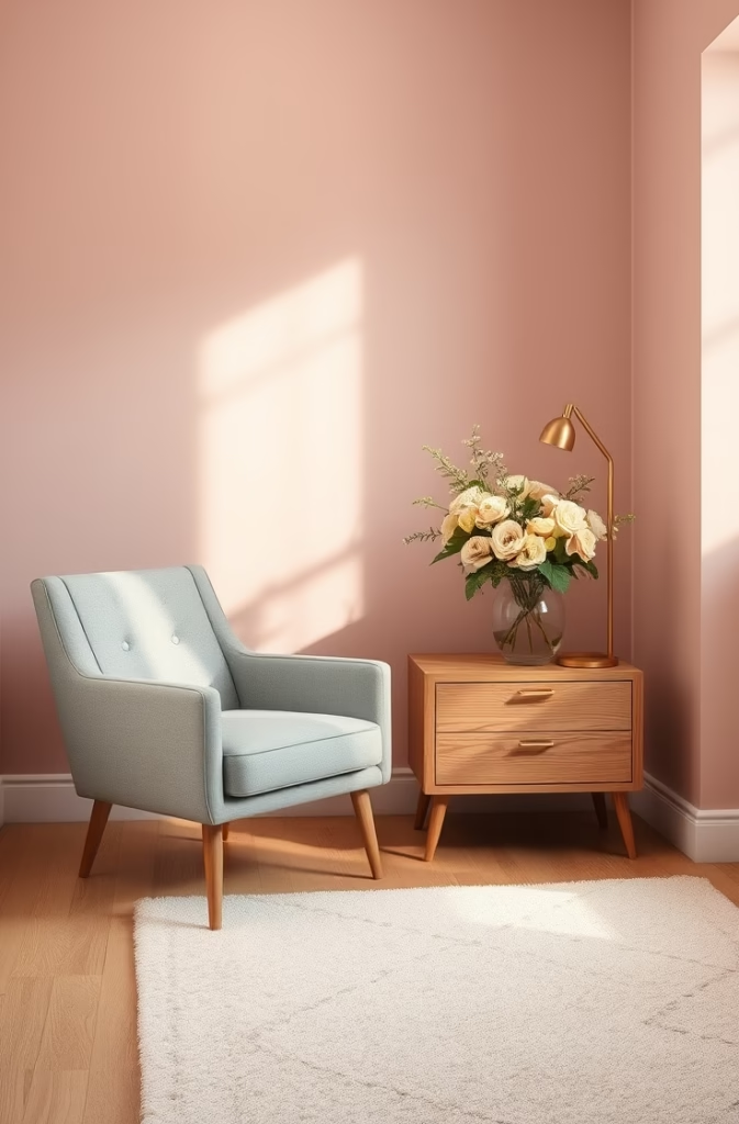
5. Dusty Pink
Subtle and romantic, dusty pink exudes warmth without being overpowering. It’s perfect for bedrooms or sitting areas, especially when complemented by gold accents or soft gray furniture.
6. Lavender
Lavender has long been associated with relaxation and calm. This soft purple shade works beautifully in bedrooms and home offices, pairing well with white or silver details.

7. Ocean Teal
A deeper shade of teal captures the essence of the sea, bringing a calming and energizing vibe to bathrooms or kitchens. Combine it with light wood or white tiles for a fresh, coastal feel.

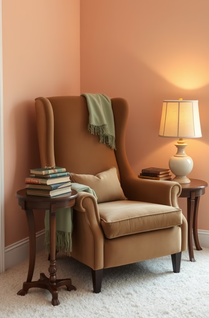
8. Muted Peach
A soft peach hue adds warmth and comfort to any space. This color is excellent for living rooms, creating a welcoming atmosphere when paired with cream or light brown accents.
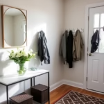
9. Light Taupe
Taupe is a timeless neutral that blends gray and beige. It’s versatile and calming, perfect for entryways or multipurpose rooms. Pair it with soft blue or green accents for added depth.

10. Powder Blue
A lighter version of pale blue, powder blue offers a dreamy and airy feel. It’s ideal for small spaces, making them appear larger and more open. Add white or pastel decor to enhance its charm.

11. Soft Yellow
Soft yellow brings warmth and optimism without being overpowering. It’s a great choice for kitchens or sunrooms, pairing well with natural materials like rattan or bamboo.

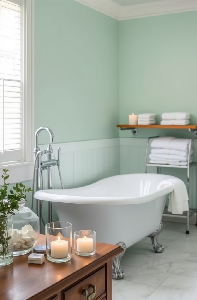
12. Cool Mint
Mint green is refreshing yet calming, making it a great choice for bathrooms or children’s rooms. Pair it with white and natural elements for a rejuvenating look.
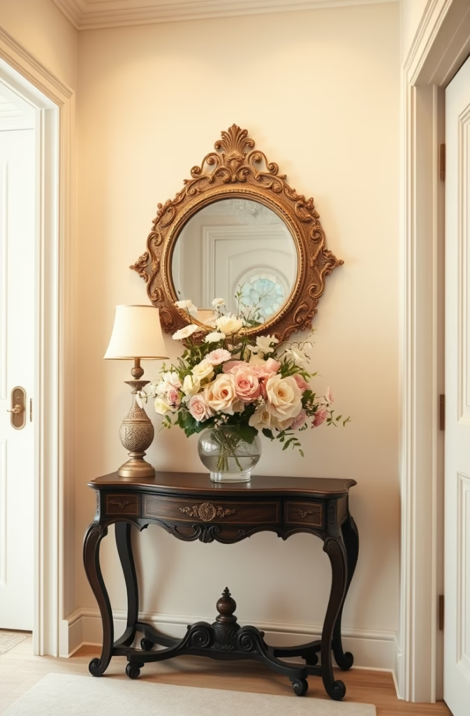
13. Off-White
Off-white with subtle undertones of gray or beige creates a clean and serene canvas. Use it in any room to enhance natural light and create a peaceful atmosphere.
14. Pale Coral
Pale coral adds a hint of warmth and softness, making it suitable for bedrooms or creative spaces. It pairs wonderfully with neutral tones or light wood furniture.
15. Light Mauve
This soft purple hue brings a sense of elegance and calm. It’s ideal for bedrooms or dressing rooms, working well with cream or gold accents.

Tips for Incorporating Calming Paint Colors
- Accent Walls: Use calming hues on one wall to create a focal point without overwhelming the space.
- Layering Tones: Combine different shades of the same color for a cohesive and tranquil look.
- Natural Light: Opt for light colors in rooms with ample natural light to enhance brightness.
- Textures and Materials: Pair calming colors with soft fabrics, wood, or stone to enhance their effect.
Popular Color Combinations
- Soft Sage Green + Cream: A classic pairing for a natural and soothing vibe.
- Lavender + Silver: Perfect for a luxurious and serene bedroom.
- Ocean Teal + White: Ideal for bathrooms or kitchens with a coastal theme.
- Warm Beige + Light Wood: A cozy and inviting combination for living areas.
FAQs About Calming Paint Colors
Q: What are the most calming colors for a bedroom?
A: Pale blue, lavender, soft sage green, and dusty pink are excellent choices for creating a relaxing bedroom environment.
Q: Can calming colors work in small spaces?
A: Yes, lighter shades like powder blue, off-white, and soft yellow can make small spaces feel larger and more open.
Q: How can I make a calming color scheme feel more dynamic?
A: Add depth by incorporating different textures, patterns, and complementary accent colors.
Q: Are calming colors suitable for a workspace?
A: Absolutely! Colors like light gray, mint green, and lavender can enhance focus and reduce stress in home offices.
Q: How do I choose the right calming color for my home?
A: Consider the room’s purpose, lighting, and your personal preferences. Testing paint samples on your walls can also help you decide.
Conclusion
Choosing the right calming paint colors can transform your home into a haven of relaxation and serenity. Whether you prefer soft blues, muted greens, or warm neutrals, there’s a perfect shade for every space. Experiment with these colors to create a harmonious and tranquil environment that truly feels like home.

Haris Virk is the creative force and expert content strategist behind ScrapSafari.com. As an accomplished writer and designer, Haris leads the development of innovative content and visually stunning images that captivate audiences. His extensive experience in crafting engaging articles and unique design ideas makes him a pivotal contributor to ScrapSafari’s success.
Haris’s keen eye for aesthetics and trend forecasting ensures that every piece he produces not only informs but also inspires readers. His proficiency extends to mastering Pinterest strategies, where his thoughtfully crafted pins drive significant traffic and amplify the site’s reach.
With a passion for creativity and a deep understanding of content dynamics, Haris Virk brings a distinctive blend of originality and strategic thinking to the ScrapSafari team, solidifying its place as a go-to source for design, ideas, and inspiration.