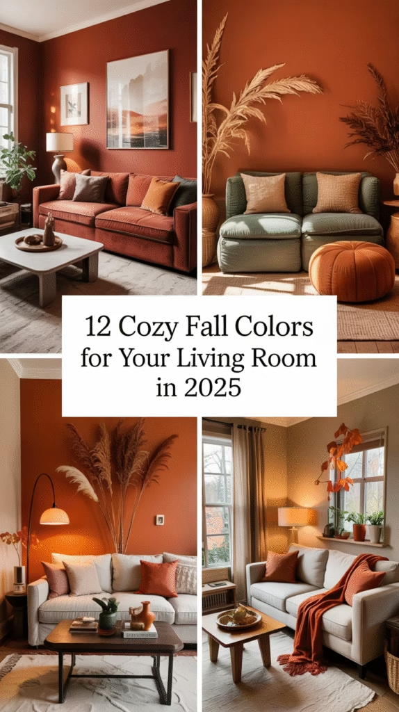
As the leaves turn golden and the air grows crisp, it’s the perfect time to refresh your home with rich, cozy hues that capture the essence of autumn. The colors for fall season for your living room in 2025 are all about warmth, nature-inspired tones, and sophisticated comfort. Whether you’re painting walls, updating accent decor, or swapping textiles, these twelve shades will create a stylish, seasonal vibe that feels both current and timeless.
Let’s explore the 12 perfect fall color ideas you can realistically bring into your living space this year—plus expert tips, styling advice, and answers to common questions.
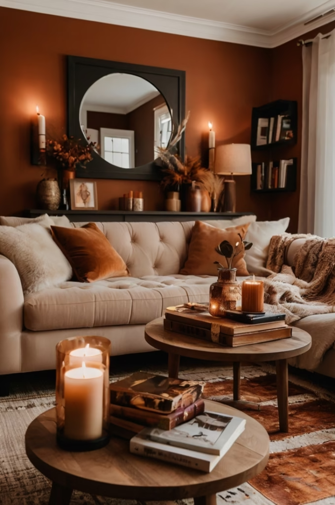
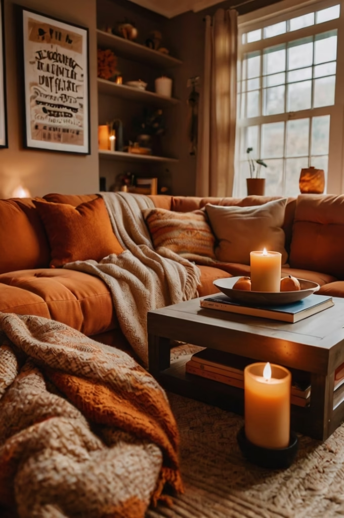
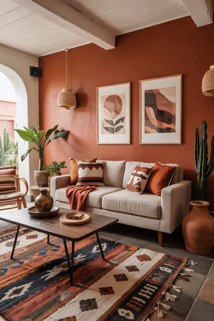
🍂 1. Burnt Sienna
Why It Works: Burnt sienna, a rich, earthy red-orange, is a top fall favorite in 2025. It adds warmth and depth without feeling overpowering.
Where to Use It: Try it on a feature wall, in velvet cushions, or a cozy throw. Pair it with beige, tan, or charcoal gray to balance the boldness.
Style Tip: Mix with brass or gold decor for a luxe autumnal look.
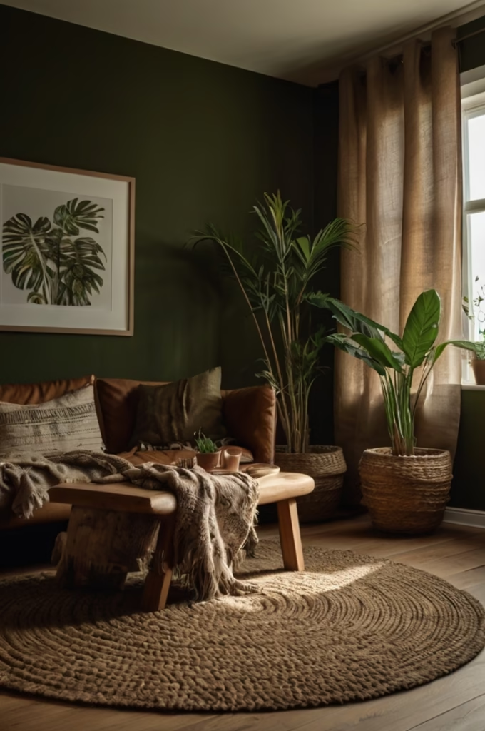
🍂 2. Olive Green
Why It Works: Deep olive tones mirror falling leaves and mossy forests—perfect for a nature-inspired living room.
Where to Use It: Use it in accent walls, velvet drapes, or botanical prints. It pairs beautifully with rust, cream, or black.
Style Tip: Combine with live greenery and wooden furniture for a grounded, organic vibe.
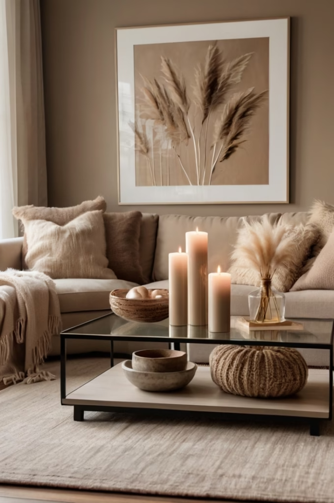
🍂 3. Warm Taupe
Why It Works: A cozy neutral that’s trending in 2025, warm taupe offers a soft backdrop for layering fall accents.
Where to Use It: Ideal for walls, area rugs, or a linen couch. It works as a base to highlight autumn accessories like copper, orange, or olive.
Style Tip: Add texture through boucle or woven fabrics in taupe for visual interest.
🍂 4. Pumpkin Spice Orange
Why It Works: Nothing says fall like pumpkin spice. This vibrant yet earthy tone energizes a room while keeping it grounded.
Where to Use It: Accent pillows, candles, wall art, or even a painted bookshelf.
Style Tip: Contrast with navy or charcoal elements for a modern twist.
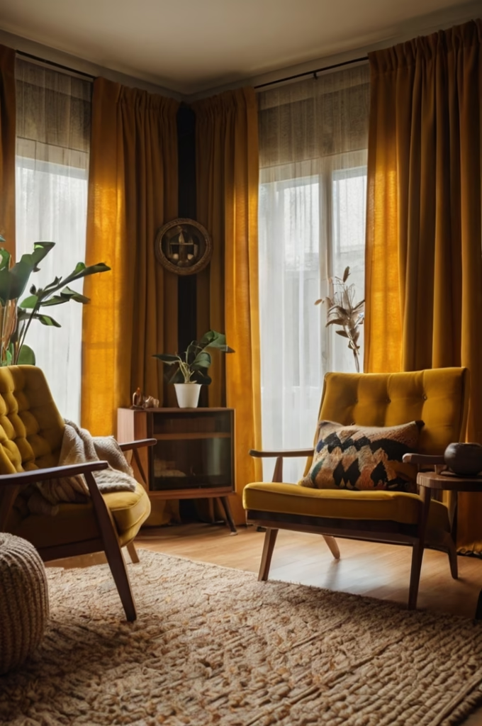
🍂 5. Mustard Yellow
Why It Works: This retro-inspired hue is making a big comeback in 2025, adding cheerful warmth to gloomy autumn days.
Where to Use It: Think ottomans, lampshades, knit throws, or curtain panels.
Style Tip: Layer with deep green or burgundy for a rich, collected feel.
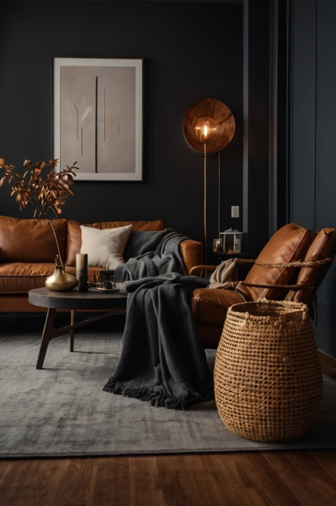
🍂 6. Charcoal Gray
Why It Works: Moody and elegant, charcoal gray is a year-round favorite, but it shines in fall when paired with warm accents.
Where to Use It: Paint one wall or go bold with a charcoal couch. Works well with bronze, burnt orange, or ivory.
Style Tip: Add leather or velvet textures to avoid it feeling too flat or cold.
🍂 7. Rustic Terracotta
Why It Works: This clay-inspired hue adds a Southwestern feel to your living room, grounding the space in earthy comfort.
Where to Use It: Great for vases, accent walls, tiles, or table decor.
Style Tip: Pair with sage green or off-white to keep the palette modern and light.
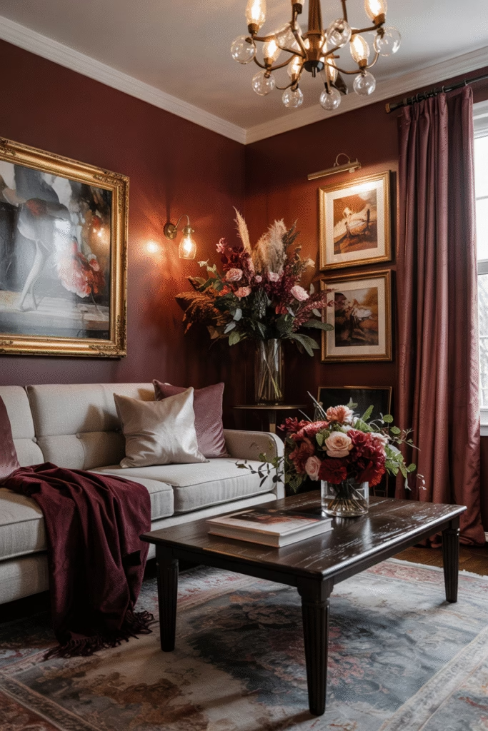
🍂 8. Deep Burgundy
Why It Works: Luxurious and romantic, burgundy instantly elevates a space while echoing autumnal leaves and red wine tones.
Where to Use It: Ideal for drapes, velvet cushions, wall art, or floral arrangements.
Style Tip: Combine with gold, forest green, or plum for a rich, layered effect.
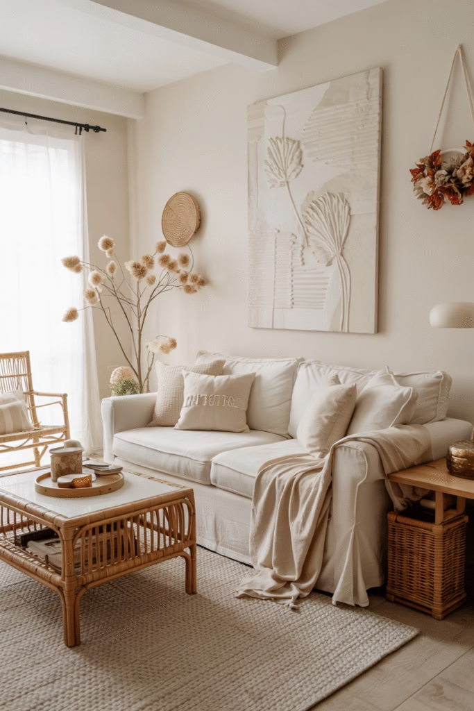
🍂 9. Creamy Beige
Why It Works: A soft, creamy beige offers calm and balance to more saturated fall shades. It’s the ultimate neutral for 2025.
Where to Use It: Upholstery, area rugs, wall paint, or woven baskets.
Style Tip: Use this as your foundational tone, layering in deeper seasonal colors with accessories.
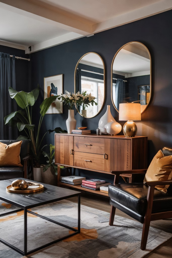
🍂 10. Navy Blue
Why It Works: While not traditionally “fall,” navy adds dramatic contrast and works surprisingly well with autumn tones.
Where to Use It: A navy velvet couch or painted wall sets a striking scene for warm-toned pillows or copper accents.
Style Tip: Mix with wood tones and mustard yellow for a mature, cozy palette.
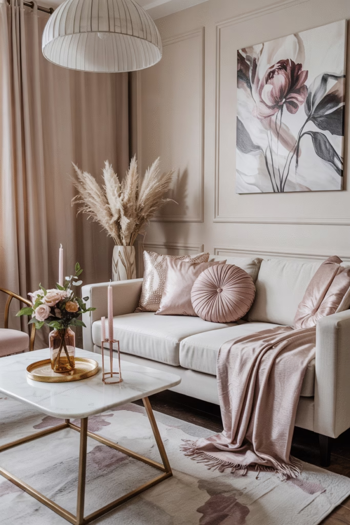
🍂 11. Soft Plum
Why It Works: This dusty purple brings elegance and depth. It’s a more unexpected fall color that feels modern in 2025.
Where to Use It: Try it in floral artwork, candle holders, or decorative bowls.
Style Tip: Combine with light taupe or rose gold for a feminine, chic space.
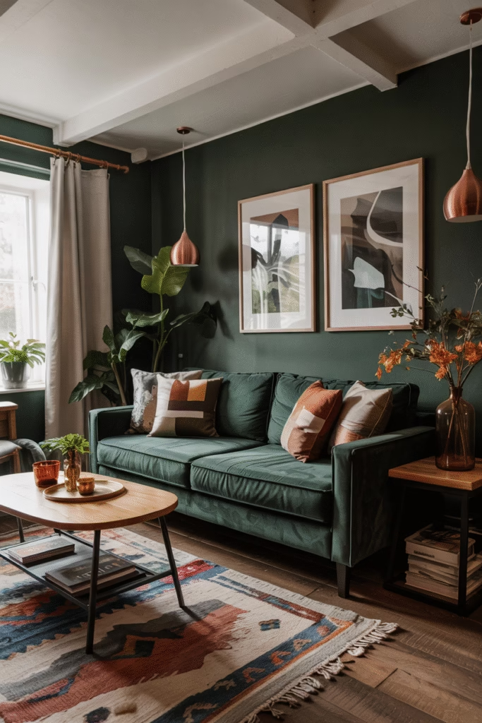
🍂 12. Forest Green
Why It Works: This bold green hue brings the essence of fall foliage indoors and gives the room a luxurious touch.
Where to Use It: Perfect for painted furniture, accent pillows, or statement curtains.
Style Tip: Layer with amber, mustard, or creamy white to avoid the space becoming too dark.
🍁 Key Facts to Remember:
- Color layering is essential—use neutrals as a base and bold hues for accents.
- Textures matter in fall: mix velvet, wool, leather, and linen for added warmth.
- Seasonal lighting like amber-toned bulbs can enhance your color palette.
- DIY upgrades like pillow covers, throws, and candle groupings are budget-friendly ways to incorporate fall colors.
🙋♀️ FAQs About Colors for Fall Season for Your Living Room
Q1: What are the top 3 must-have fall colors in 2025?
A: Burnt sienna, olive green, and mustard yellow are the leading choices, offering a mix of warmth, nature, and nostalgia.
Q2: Can I mix cool tones with warm fall shades?
A: Absolutely. Navy blue or charcoal gray can ground warmer colors like orange or terracotta, creating balance.
Q3: What’s the easiest way to add fall color without repainting?
A: Use seasonal accessories like pillows, throws, art, or florals to introduce new colors affordably.
Q4: How do I keep my fall living room from looking too dark?
A: Incorporate light neutrals like cream or beige and use strategic lighting to brighten shadowed areas.
Q5: Is wallpaper a good idea for fall tones?
A: Yes—textured or floral wallpaper in fall hues like plum, sienna, or forest green can add instant coziness.
🍁 Final Thoughts
The colors for fall season for your living room in 2025 go beyond the basic orange and brown of past decades. This year is all about earthy sophistication, texture-rich designs, and color palettes that blend tradition with modern style. Whether you’re giving your space a small seasonal update or a full refresh, the hues above offer endless possibilities for crafting a cozy, on-trend autumn retreat.
So grab a mug of cider, roll out that new rug, and let the rich palette of fall bring your living room to life!

Haris Virk is the creative force and expert content strategist behind ScrapSafari.com. As an accomplished writer and designer, Haris leads the development of innovative content and visually stunning images that captivate audiences. His extensive experience in crafting engaging articles and unique design ideas makes him a pivotal contributor to ScrapSafari’s success.
Haris’s keen eye for aesthetics and trend forecasting ensures that every piece he produces not only informs but also inspires readers. His proficiency extends to mastering Pinterest strategies, where his thoughtfully crafted pins drive significant traffic and amplify the site’s reach.
With a passion for creativity and a deep understanding of content dynamics, Haris Virk brings a distinctive blend of originality and strategic thinking to the ScrapSafari team, solidifying its place as a go-to source for design, ideas, and inspiration.